Student’s Curriculum Branding
These next few projects are branding projects I worked on for the Student’s Ministry team. There was lots of room for creativity and experimentation in both the ideation phase and the brand implementation due to the variety of different deliverables needed for each brand.
The Problem:
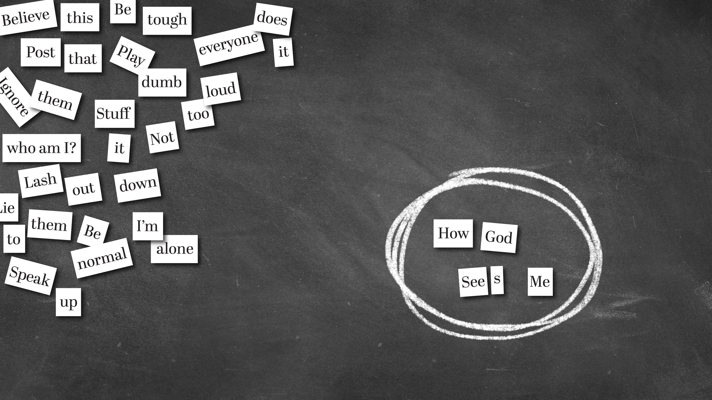
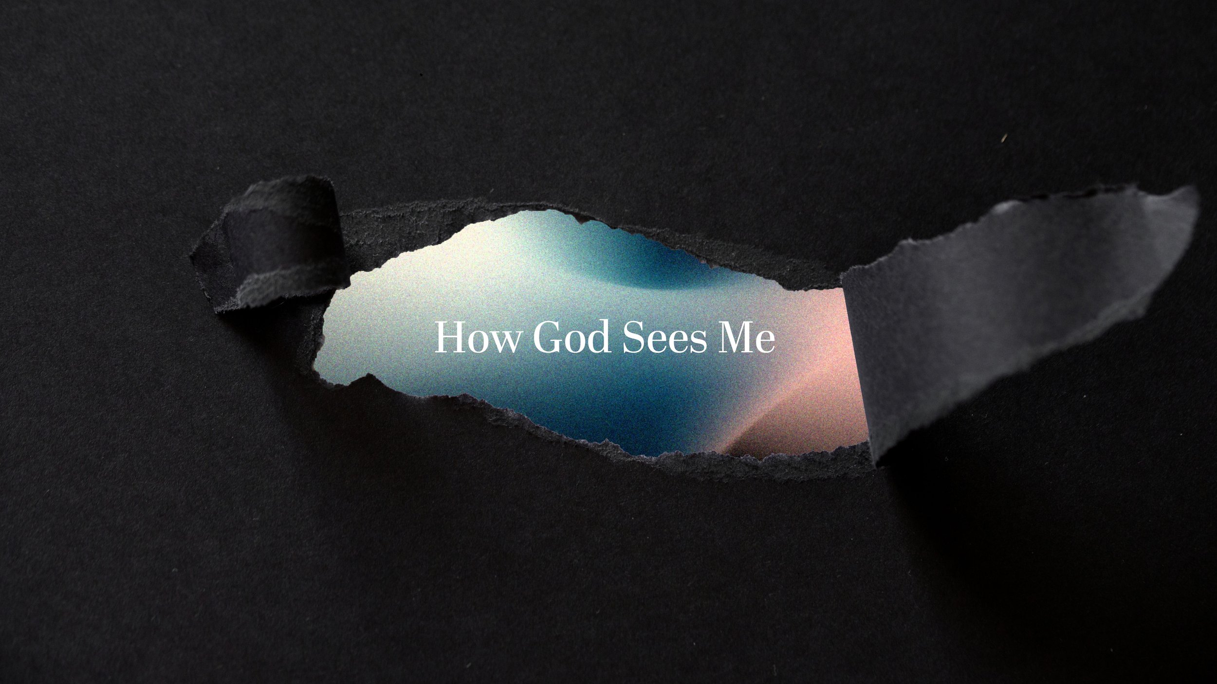
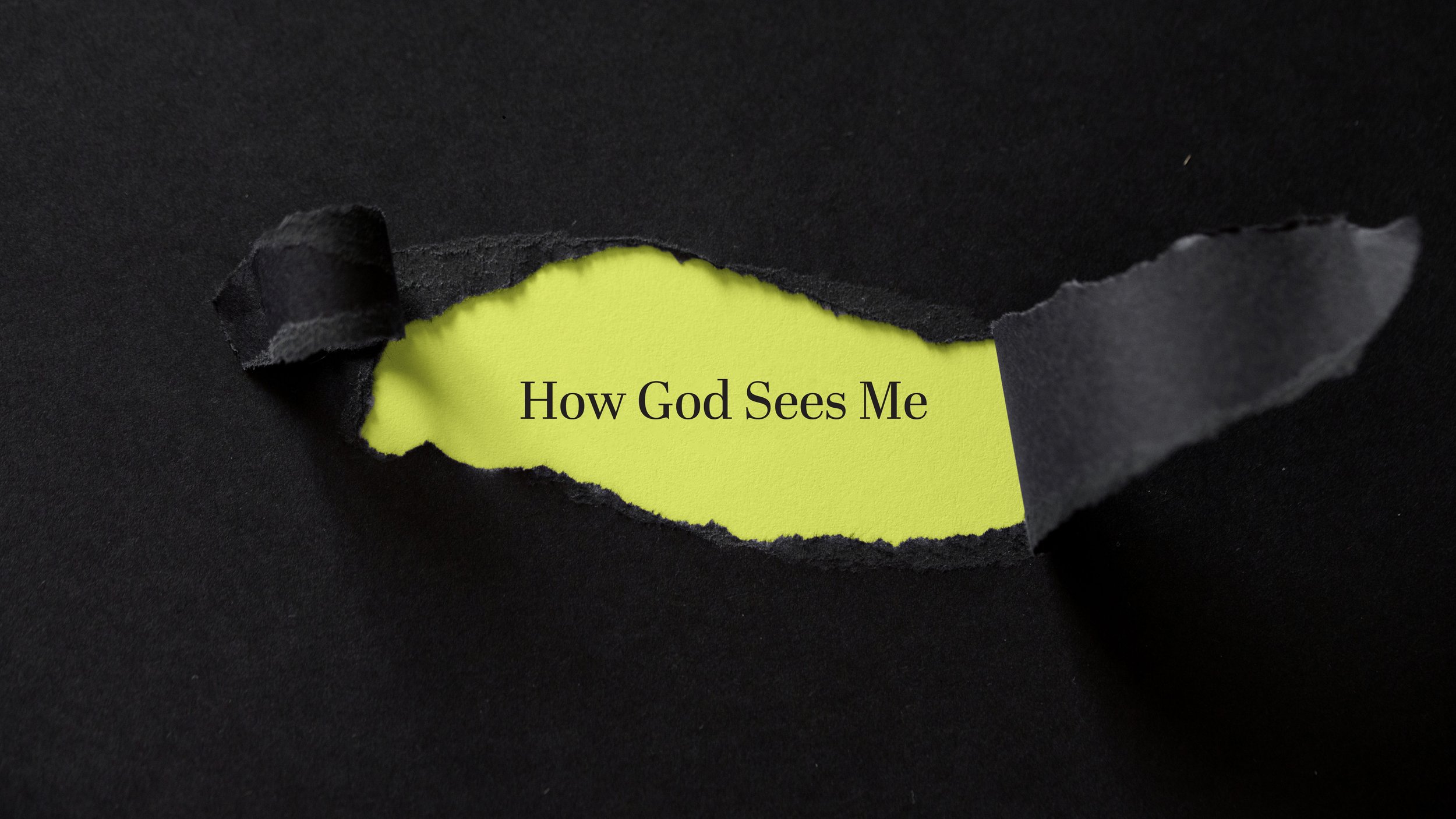
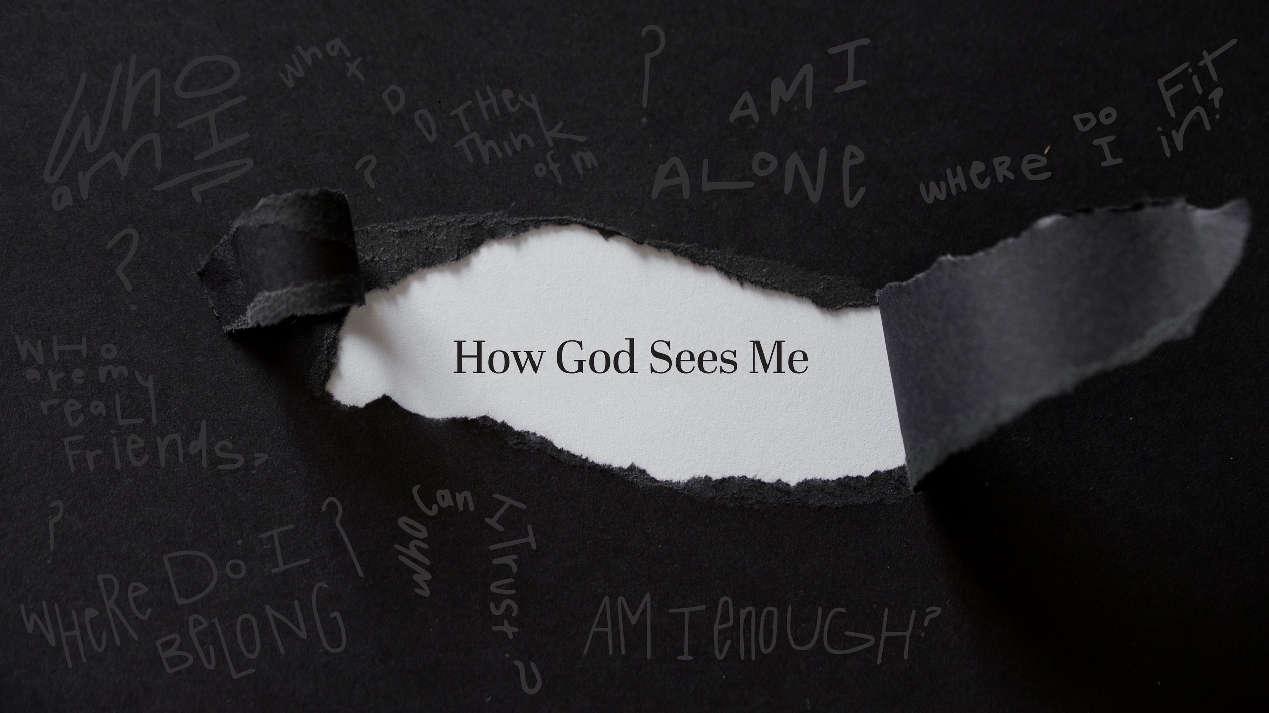
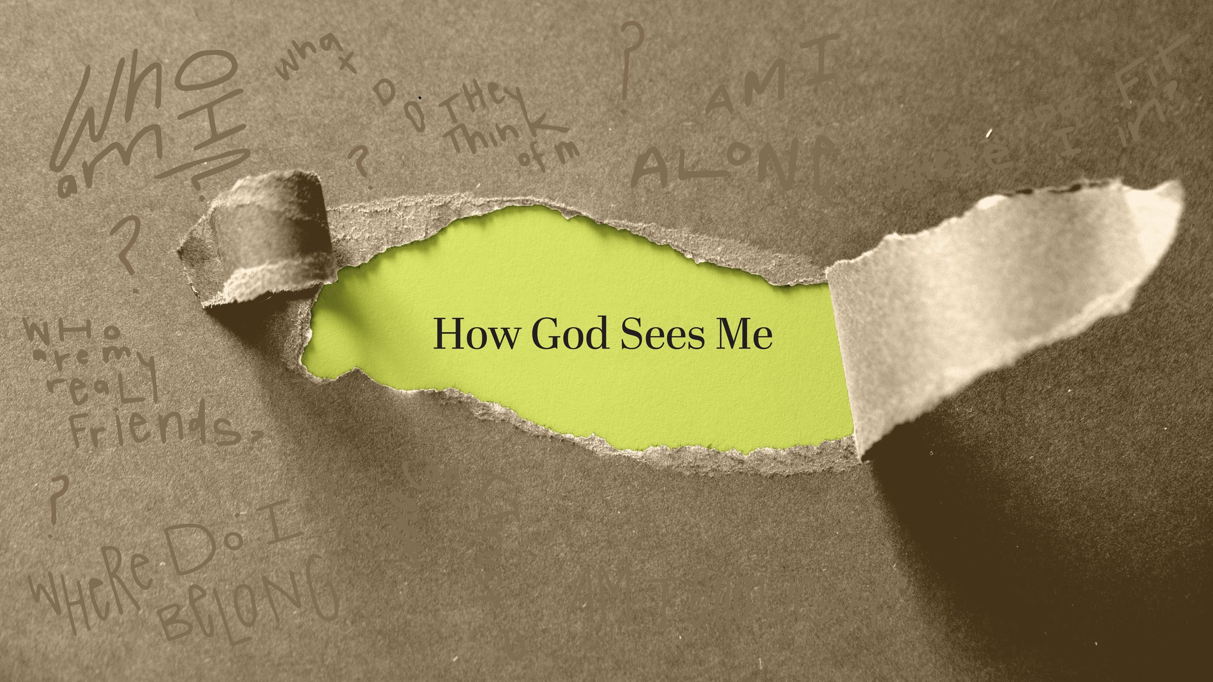
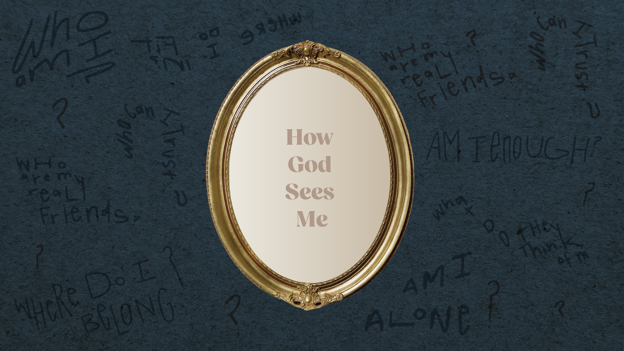
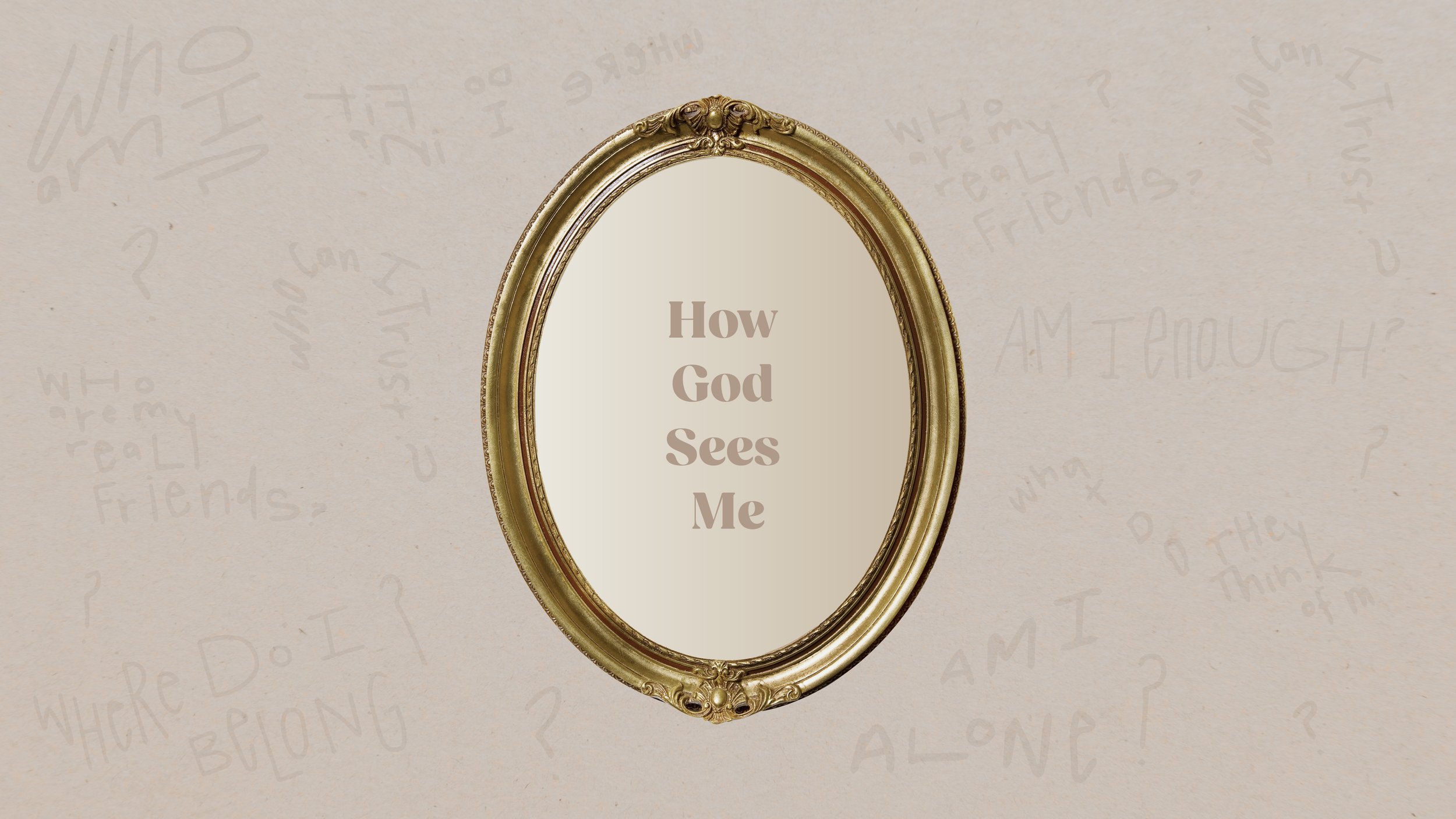
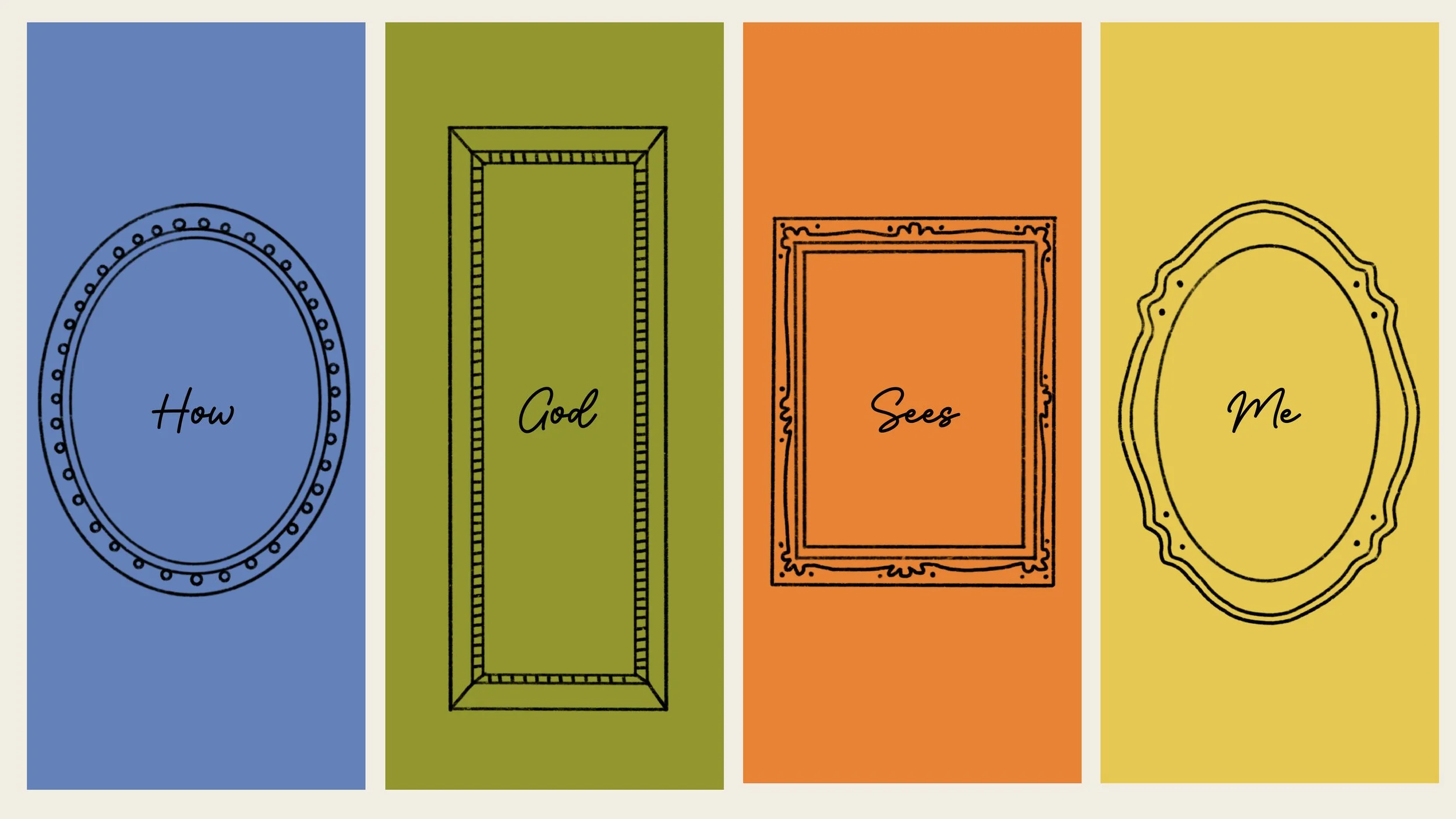
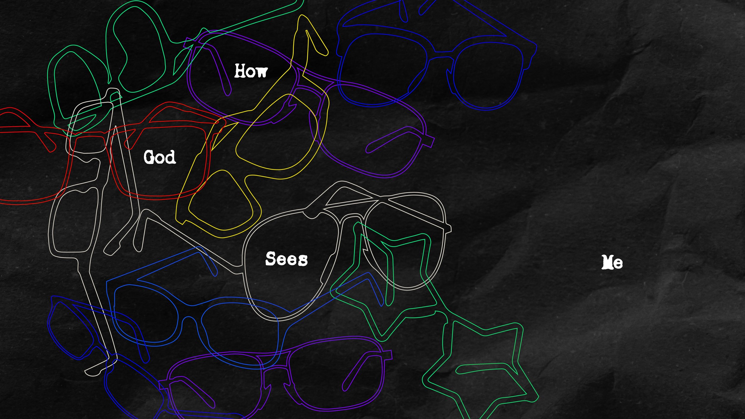
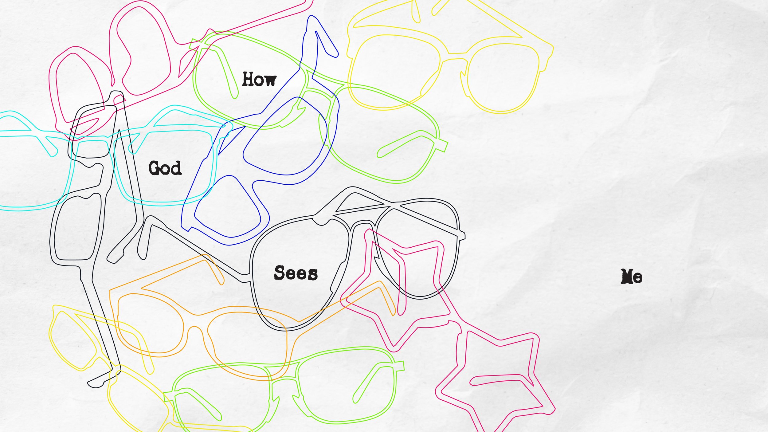
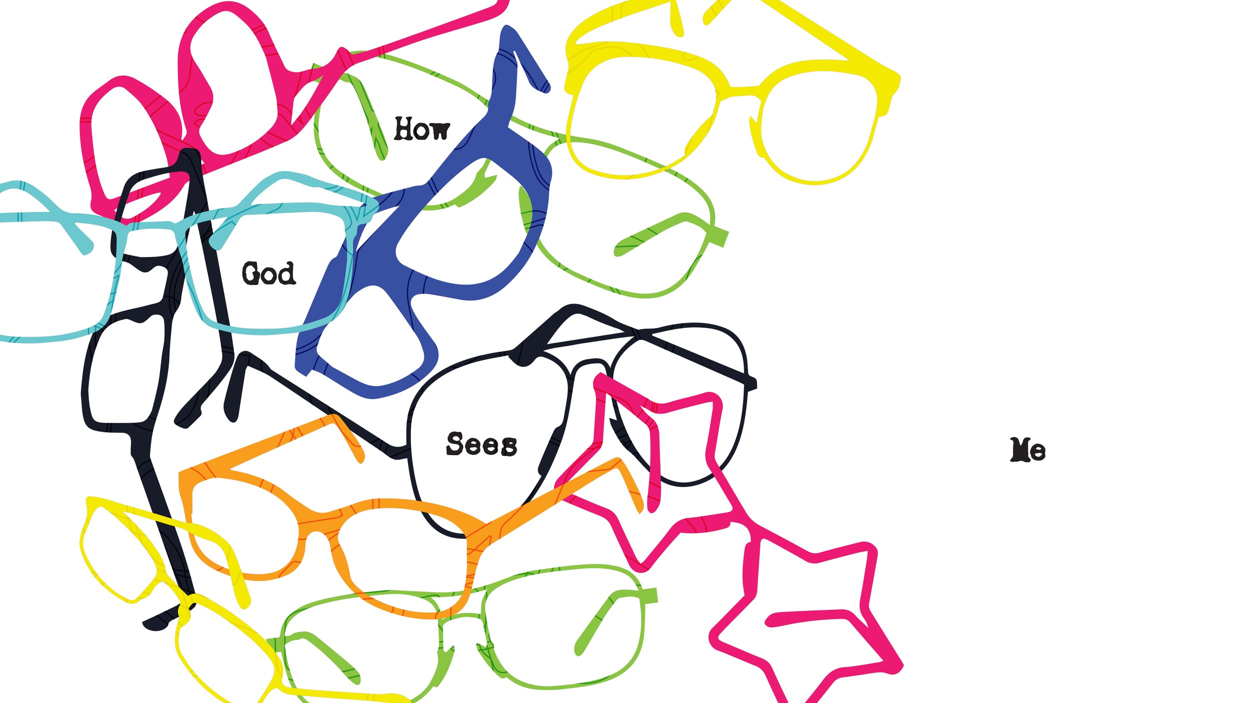
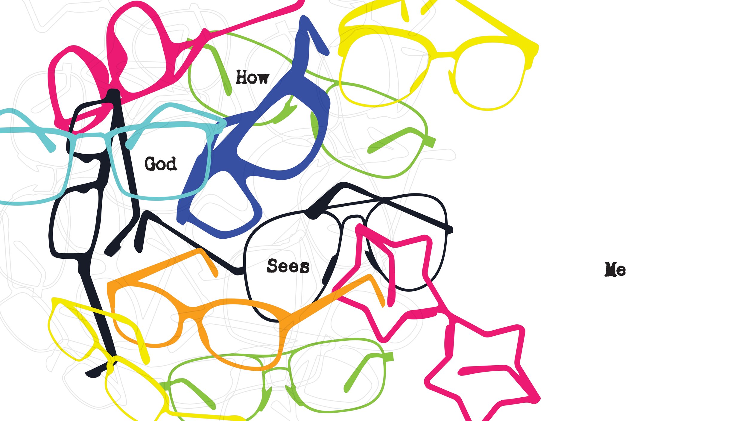
In this project, I was tasked to create two separate brands for the Student Ministry team’s Wednesday night message series, for both Middle school and High school students. The series How God Sees Me was a four weeks long, centered around identity and the challenge of finding one’s identity as a teenager. They wanted the design to feel hopeful, whimsical and rooted in truth. This project, like most other student series brand projects, came with quite a few deliverables including the series art, web graphics, side screens, and social graphics.
The Solution:
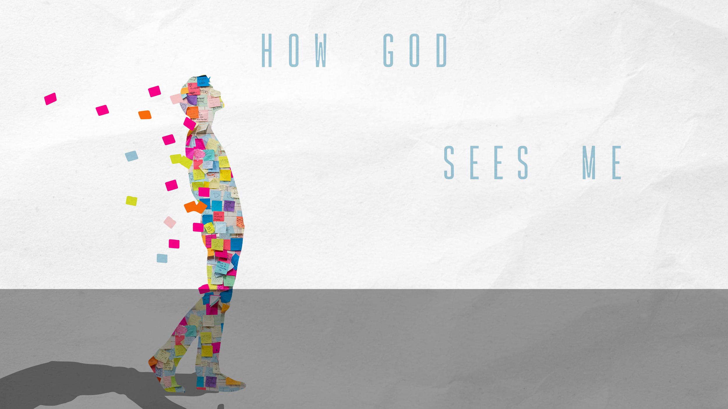
In this project I created branding that encompassed hope and the challenge of finding ones identity is for teenagers. With the use of illustrative elements and color while also honing in on the seriousness of the topic of identity as well. I pitched a wide variety of designs to the team and they chose similar and yet slightly different designs perfect for each age group. The designs are fresh and youthful and have longevity for the number of deliverables that I needed to create. Below are some of the iterations I am proud of, but didn’t get chosen and also the final chosen designs.

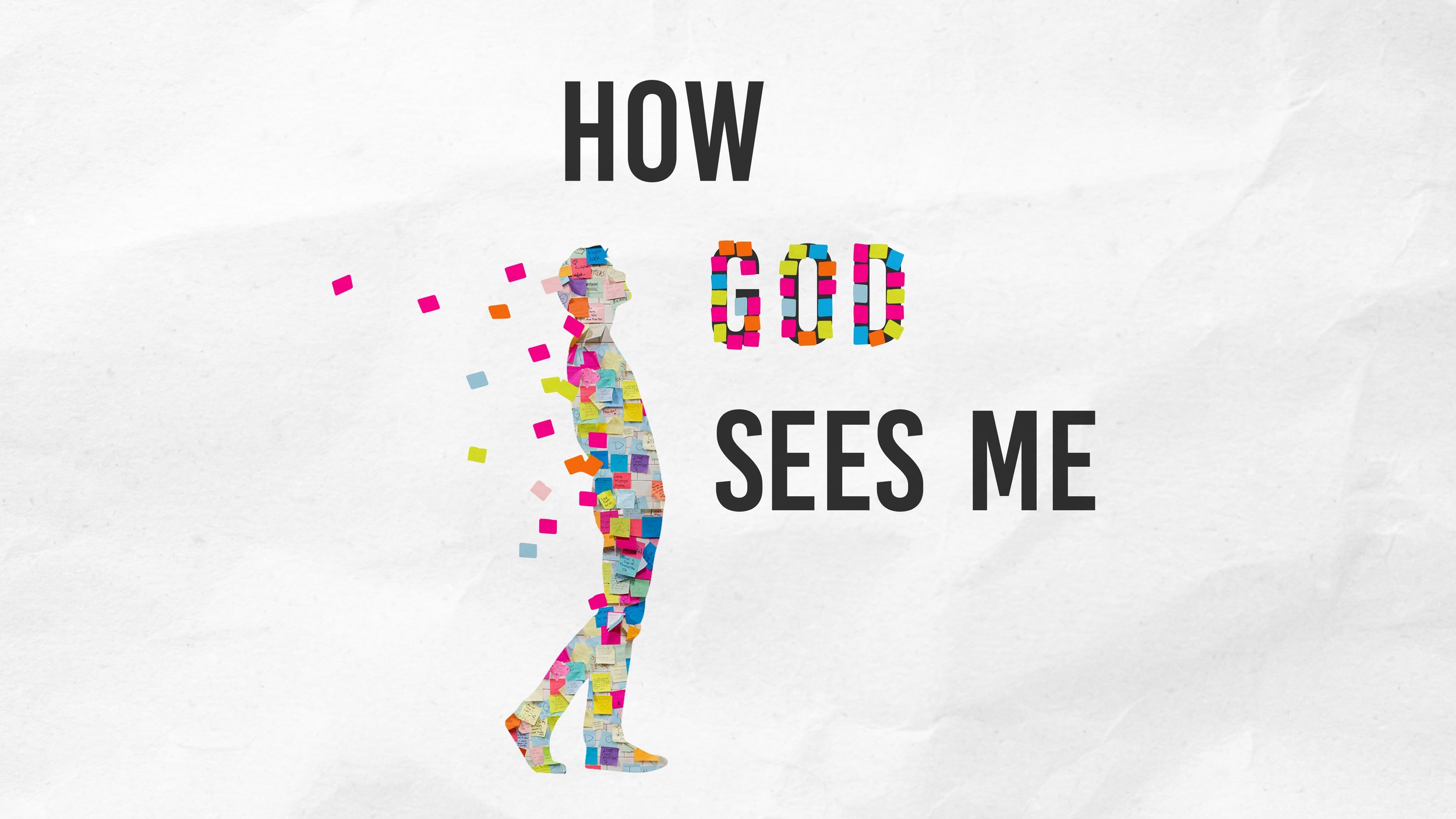

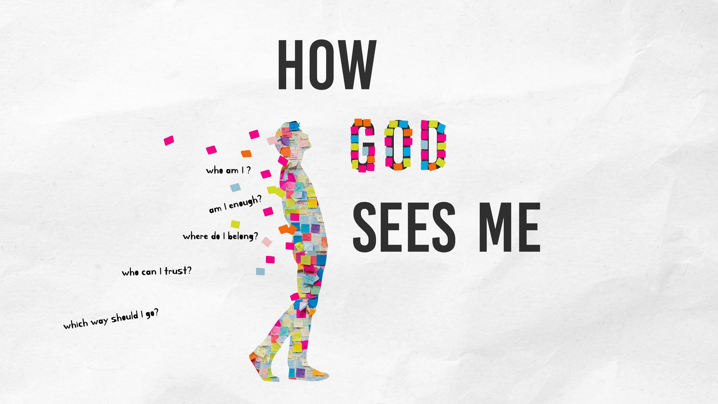
Below is the final design that the Students team chose for the Middle School and then the High school students.


The Problem:
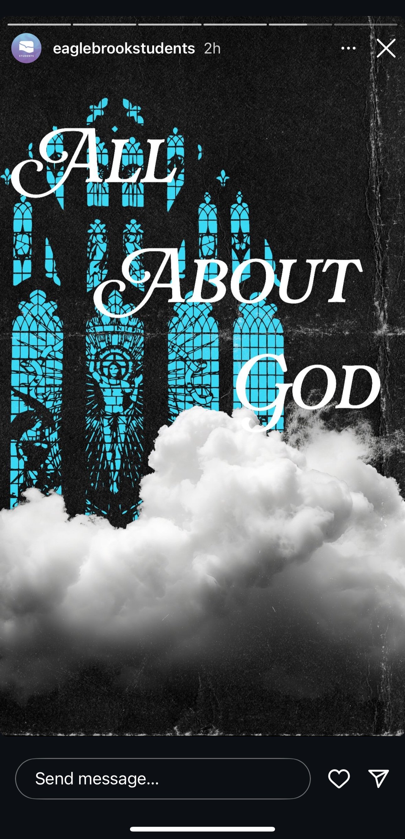
In this project, I was asked to create another set of two separate brands for the Student Ministry team’s Wednesday night message series. The series was titled All About God the two designs were created for Middle school and High school students. The Students Ministry team wanted the series to connect with the larger than life awe inspiring presence of God while still feeling personal and approachable. This project like most other student series brand projects came with quite a few deliverables including; the series art, web graphics, side screens, and social graphics.
The Solution:
I was able to created two unique brands encompassed the awe inspiring presence of God while also creating a design that felt approachable and relatable to the young audience. I pitched a wide variety of designs to the team and they chose similar and yet slightly different designs perfect for each age group. The designs are bold colorful relatable to the high school and middle school students while also creating a feeling of larger than life and at the same time personable. Below are some of the iterations I am proud of, but didn’t get chosen and also the final chosen designs.


Below is the final design that the Students team chose for the Middle School and then the High school students.


Below is the final branding in use on social.


All designs are property of Eagle Brook church